Micro-frontend architecture and React with Web Components
This blog post is a cross-post of the article originally published on Medium.
Working as an army of developers divided into 10s of feature teams, one of the big topics in our company is to move to a micro frontend architecture. So every team in our company can be truly cross-functional and have an end-to-end autonomous deployment, decreasing the time to market for the features to be developed. We currently have dozens of different frontend projects developed with a variety of frontend tooling(old fashion template engines, Vue, React, Angular).
This situation forced us to try out multiple ways of isolating different team’s frontend codes from each other. One of the most successful examples is puzzle.js, which is powering our mobile website. However, not all projects have the tooling for micro frontend architecture ready at hand. So we have to improvise sometimes.
In this article, I will tell you about a new feature we are rolling out at Trendyol, how we used web components while implementing a part of this new feature, and what we learned. Web Components is an awesome technology that lets you create atomic UI elements with any tooling you want, and then share it with other projects that use different technology stack. I hope this will give you some insight into using Web Components, and some problems with it that you may face. If you want to skip the story and see the code, see our proof-of-concept React app at Trendyol/react-webcomponent-poc.
Introducing the Seller Store Pages
Trendyol is one of the biggest e-commerce marketplaces in Turkey. Marketplace sellers in our platform are first-class citizens and our team is always developing new tools to let our sellers reach their target audience.
This is the story of one such tool. A custom showcase page that lets sellers showcase their products/campaigns/events. Sellers can edit and preview this page anytime that they want using the partner panel. And the customers can access this page using the product detail page or through other channels in/out of our application via deep-link.
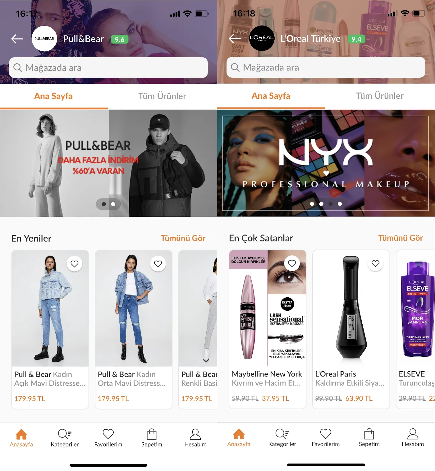 Two Showcase Pages in Production (Pull&Bear Türkiye and L’Oreal Türkiye)
This feature consists of two core parts:
- Implementing a dynamic component rendering system on all end-user applications (Affected Teams: Web, Mobile Web, Android, iOS)
- Creating an editor for our sellers where they can customize their page look, upload promotion banners, highlight their products and preview the result (Affected Teams: Seller Center)
A nice example of why we need the Micro frontend architecture. Just a single feature that spans across 5 different teams that develop frontend applications. After consideration, a new feature team was created. The responsibilities of the team including:
- Development of the Seller Store Page Editor
- Implementation of dynamic component rendering for platforms using web technologies (Web, Mobile Web)
- Development of Backend services handling the business logic of page creation, validation and serving
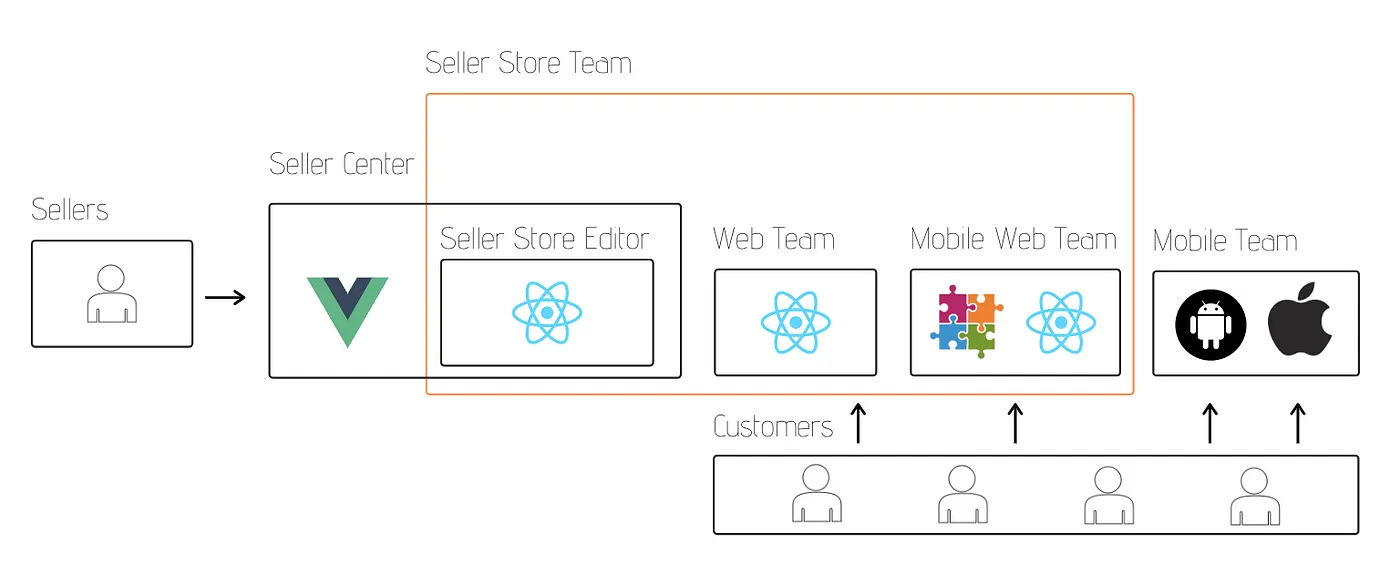 Boundaries of the Seller Store Team
The mobile team already had a dynamic component rendering system developed to be used in different sections of our applications, making it easy to deliver the initial version of this feature to our customers. As the Seller Store team, we initially created the REST APIs to be used by our mobile team and handcrafted some showcase pages to be used in the production. Also starting to develop the Seller Store Editor in parallel. To be used by our sellers in the existing Partner panel which they use for everything else.
Integrating the Seller Store Editor into existing Seller Partner Panel
As the Seller Store team, React was our framework of choice because we wanted to get dynamic component rendering as fast as possible on web platforms (without Web Components). And those teams already have people experienced with using React to create UIs for our customers. We also wanted to use Redux, Typescript, and RxJS to craft a reactive application that has business logic separated away from UI components as much as possible.
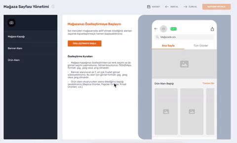 Demonstration of Creating Your Own Showcase Page
This was our initial challenge. We already have a panel that the sellers in our platform use to manage their Trendyol portfolio. This panel is written in Vue, and we need to embed our editor as a single page in it. In this article, we will talk about the implementation of this particular page.
Our only requirement was to keep the Seller Store team as autonomous as possible. Initially, we were thinking about using iframes but we decided to give Web Components API a shot. The idea was to use as much feature(authentication, analytics, etc.) as possible from the already existing Vue panel through sync calls / async messages since both our editor and the panel code would be executing on the same page.
We quickly spun up a POC. Demonstrating how to make a single page React application and expose it as a custom element. This POC had all the CSS for our application encapsulated into a shadow root, exposed itself as a custom element and used redux for routing so it would not break the routing of the original page. You could start using this application in any HTML page as follows:
<html>
<head>
  <!-- Seller Partner Panel related code -->
  <script src="$public-url/seller-store.vendor.min.js" type="text/javascript"></script>
  <script src="$public-url/seller-store.min.js" type="text/javascript"></script>
</head>
<body>
  <!-- Seller Partner Panel related code -->
  <seller-store-editor />
  <!-- Seller Partner Panel related code -->
</body>
</html>
You can find the POC we created under this repository for reference. Initially, this setup worked really well, however after a period of time working with this and facing some issues, we decided to move away from the web components. Let’s look at those reasons.
Isolation of CSS with Shadow DOM
When you are trying to import a frontend component into your project, even if the component is written with the same technology stack, you need a way to isolate their CSS. Otherwise, you will have CSS clashes that may break your or the imported component’s styling. A popular solution to this in the React world is to use CSS-Modules. You import your CSS into JS and let Webpack rename your CSS whilst bundling your code. No more clashes!
However, you will still have issues if you have global CSS selectors that affect the imported components. The web component API’s solution to this is to create a Shadow DOM. With Shadow DOM, your component will be rendered separately and will not be affected by any external CSS selectors. The same applies to styles you write as well, they won’t affect the parent container.
When using Shadow DOM with React/Webpack the first issue we faced was with the style-loader. By default, every CSS imported by your JS files is automatically injected into <head> tag of the page. And since your Shadow DOM is not rendered as a part of the original page, your styles won’t take effect. There are some solutions to this. You either use the to-string-loader and create a <style> tag inside your Shadow DOM. Or you configure style-loader to inject the styles to your Shadow DOM dynamically. We got the POC working with the ReactShadow and to-string-loader libraries.
import root from 'react-shadow';
import styles from './components/index.scss';

class SellerStoreEditorWebComponent extends HTMLElement {
  // ...
  private getComponentToRender() {
    return (
      <root.div>
        <SellerStoreEditor />
        <style type="text/css">{styles}</style>
      </root.div>
    );
  }
}
With this, we isolated our styling from the Vue panel. We used SASS for styling our components and imported every 3rd party components CSS to our root SCSS file. This worked fairly well until we tried to use 3rd party components that used style-loader to inject CSS to <head>. Unfortunately, we could not find a way to override the settings of these components so they would inject their CSS inside our Shadow DOM instead of <head>.
This really restricted our choices when we were selecting components to work with. We either had to fork the component to make it so it won’t inject the CSS to <head>, or we would just select another component that did not do this.
There can be another way of solving this issue permanently that we do not know of, however, there is another issue that is not possible to fix with Webpack tooling.
The issue with the global query selectors
When we render all of our SPA inside a Shadow DOM for CSS isolation, another property of the Shadow DOM comes into play. It isolates your DOM elements so they can not be accessed by the document.querySelector globally. At first glance, this makes sense. We would not want another team’s code to interfere with ours, by globally injecting functionality to our DOM elements.
However, in some cases, you need this. For example when you want to re-use existing functionality like setting up analytics on button clicks. The solution to this would be creating your Shadow DOM in open mode and passing your shadowRoot reference as a parameter to the initialization code.
The same problem is faced when you are using libraries that depend on the document.querySelector In our case, the problem was with the reactour library. It uses a selector and finds the element to highlight with document.querySelector We had to fork the library, just to make it work. You can see similar issues with more popular packages like reactstrap. Just googling problem OR does not work OR broken "shadow dom" inurl:issues site:github.com can point you to more issues.
This was another problem that restricted our selection of components. It added additional complexity to our workflow. We had to fork and manage a private version of a package until our PRs get merged to the public version.
So we started thinking about if the Web component/Shadow DOM was the right tool for the job. Maybe the API was better suited to be used for smaller elements and not a whole SPA application? Should we change our code to use an Iframe?
An Alternative Approach
As I have said before, we have other teams in the company who are trying to adopt a Microfrontend architecture. Seller Center Team was one of them. Since the code written in their partner panel is managed by multiple teams, and the monolithic project was getting harder to maintain. They were also experimenting with a new approach to splitting the monolith while we were working on our feature.
The solution they found was breaking the monolith into different projects and creating a base project that looks at the URL and decides which project to serve. The base project includes the common features(authentication, analytics, support) and the layout header/footer/a div to render your content. So if you enter /product/x the product project is served. If you enter /seller-store our project’s Javascript file is served.
Since the base project they created does not include any CSS/code that would interfere with our code. This seemed like a better way to serve our SPA. We refactored the part of our codebase where we created a custom element and rendered our content into a Shadow DOM. Instead, we served an extra manifest file that points to the latest version of our JS file. And just rendered to a plain old div#app container.
This still fitted our needs. We did not worry about the CSS isolation, we could still make calls to common features present in the base project of Seller Partner Panel and we were still autonomous. This also made it possible so we could use any React component we want. So hats off to the Seller Center Team for making this possible :)
Conclusion
It’s surprisingly easy to use Web Components API with React(check out our POC). However, you may have problems with some 3rd party components you are using because they may inject CSS into <head> or use document.querySelector to try to access elements inside your Shadow DOM.
Embedding a single-page React application inside a Shadow DOM let us instantly start developing a new feature inside a Vue application. We opted out of using Web Components because of the complexities it brought with it when using 3rd party components. Even if these complexities were solvable, we had a different approach that was better suited to our use case.
We will be using Web Components API more selectively. We think it will be more useful in cases where a single page consists of more than one project’s components that may talk to each other through sync calls/async messages. Or in cases where you just need a small component that will be used by different technology stacks.